Draw A Logo
Intro [Bridge In]
^
- How many of you have a logo?
^
- How many of you can draw (with a pencil)?
^
- You may want a logo one day for a business, personal project, design project, blog
^
- Our objective for lesson is for you to draw yourself a logo
- You’re going to need a piece of paper, and a pen or pencil
Intro [Bridge In Motivation]
^
The Apple logo’s story begins with its first design in 1976, created by Ronald Wayne, featuring Isaac Newton sitting under an apple tree, symbolizing the moment of his discovery of gravity.
However, Steve Jobs found this logo too old-fashioned and difficult to print on smaller products, leading him to hire Rob Janoff to redesign it.
^
![]()
^
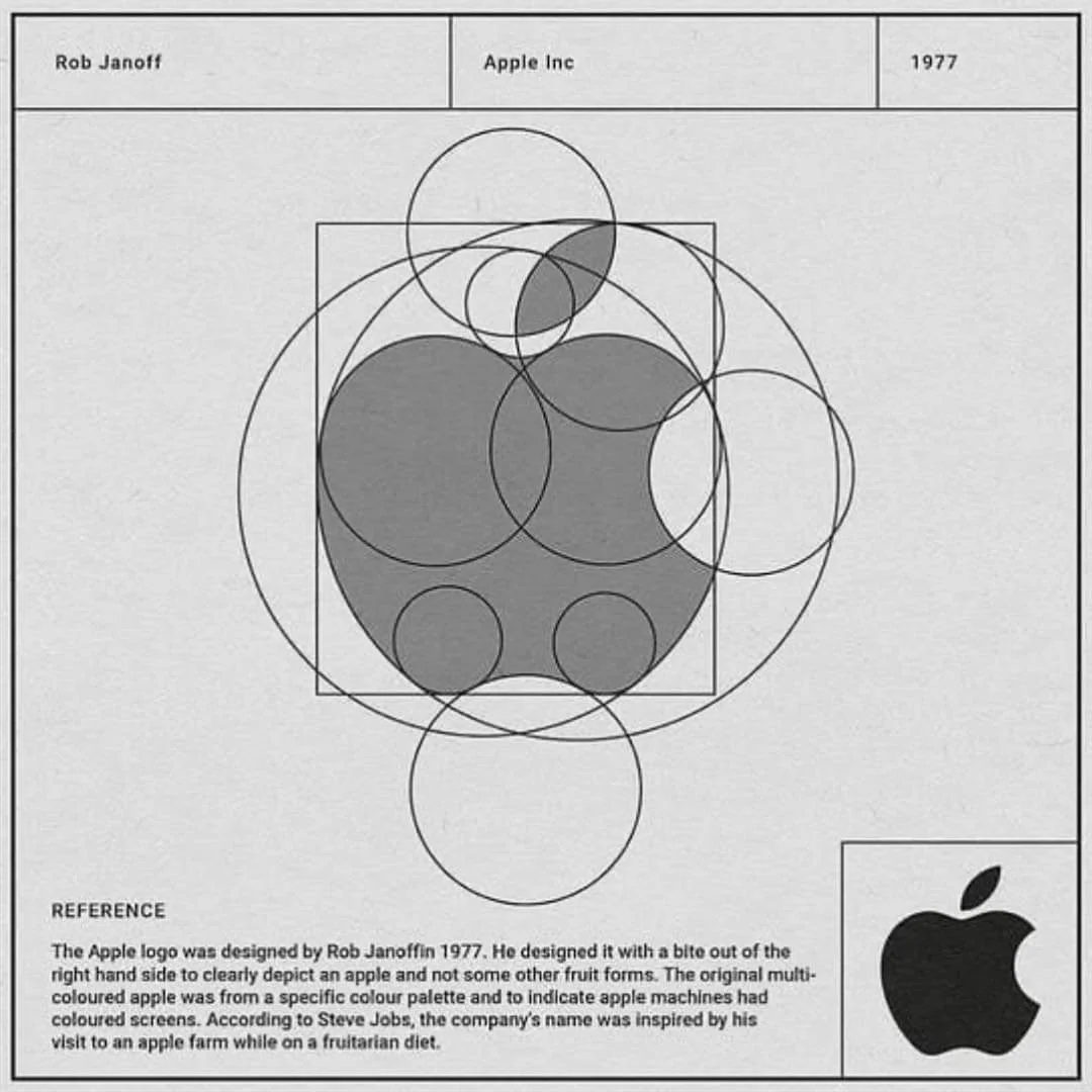
Rob Janoff Apple Logo Diagram - Circles 1977
^
Rob Janoff Final Color Palette Matches Apple’s Cutting Edge Color Technology
![]()
Tips About Drawing Your Logo
^
Some tips about drawing your logo
1. Design
^
A logo should be distinctive and not resemble other logos to ensure it can be copyrighted and recognized easily
2. Memorability
^
The logo should be memorable and evoke positive associations about the business/project
^
The logo should reflect the brand’s values and appeal to the target audience
3. Color Usage
^
Use color wisely to convey the right emotions and ensure the logo works well in both color and black and white
- Two logos, and different logo formats
4. Scalability
^
The logo should maintain its clarity and proportion when resized. [image types: svg, png, webp, eps, pdf]
5. Trend Avoidance
^
Maybe avoid following current design trends to ensure the logo remains relevant over time - [think about the longevity of your logo]
6. Customer Focus
^
Understand the customer base and market to create a logo that resonates with them
7. Testing
^
Gather feedback from focus groups to ensure the logo appeals to the target audience.
These tips are essential for creating a logo that effectively represents a brand and resonates with its audience.
The Next Step Is for You Guys to Make Yourself Logo
^
You only require a pen and paper, or pencil and paper Just a take a few minutes to draw a few logos
^
![]()
Show Off Your Designs [post-assessment]
^
Voluntarily, and we are short on time, so won’t do this. But if we had the time, each of you would come up here and share your logo, as well as your vision for the logo.
Summary
- We thought about some reasons why you might want a logo
- Then we learned 7 tips or things to think about when designing a logo (or procuring one)
- We drew our first logo sketches